Change is good; the new Ergomax logo
Ergomax is growing—not only in size but also in what we stand for and what we represent. That’s why the old logo and slogan no longer fit us. After much thought, sketching, and collaboration with designers, we arrived at a new design at the end of last year.
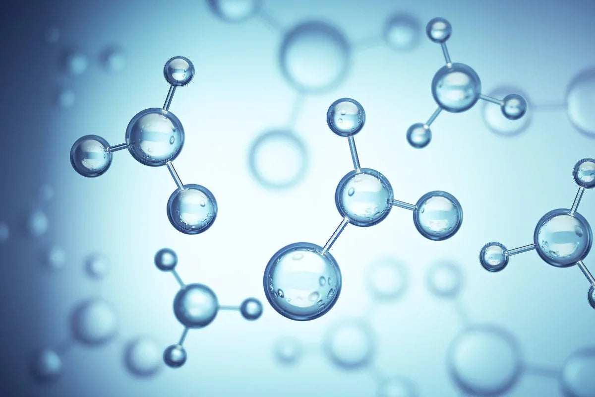
The new logo has been simplified to a single hexagon with a geometric core. Everything in nature is built from simple geometric patterns woven into molecular structures. These patterns form the foundation of all plants, humans, and animals in their complex and beautiful forms.
Scientifically, geometry is deeply connected to physics, since all particles and forces in the universe are manifestations of exceptional geometry. Because we believe that physical laws together with biology form the basis for good health, this is reflected in our logo: a geometric pattern in a molecular structure.
The same particles are also a symbol of sustainability, because they are recycled in life processes. This means your body also consists of particles that once belonged to another living being on Earth.
In addition to the new logo, we also updated our slogan from “Premium Quality Supplements” to “Your Health. Our Mission.” The new slogan was carefully chosen and expresses the essence of what Ergomax stands for: your health and our contribution to it. We believe everyone should be able to pursue their personal optimum, and we are happy to support you in that.
A new logo and slogan naturally come with new product labels and a redesigned website. In the coming weeks, you will gradually see these changes!
We’d love to hear your feedback on these updates!

